The Psychology of Color in Interior Design: How Colors Can Shape Our Moods and Emotions
When it comes to interior design, color is one of the most powerful tools at our disposal. Not only can it add visual appeal and aesthetic interest to a space, but it can also have a profound impact on our emotions, moods, and even behavior. This is because colors have a profound psychological effect on us, and understanding the psychology of color can help us make informed decisions when it comes to designing our living and working spaces.
The Emotional Impact of Color
Colors can evoke a wide range of emotions, from calmness and serenity to energy and excitement. Warm colors like red, orange, and yellow can stimulate our senses and increase our heart rate, while cool colors like blue, green, and purple can have a calming effect. Neutral colors like beige, gray, and white can provide a sense of balance and stability.
Research has shown that colors can also have a significant impact on our mood. For example, exposure to natural light and warm colors has been shown to improve our mood and reduce symptoms of depression. On the other hand, dark and cool colors can have a negative impact on our mood, making us feel sad, anxious, or lethargic.
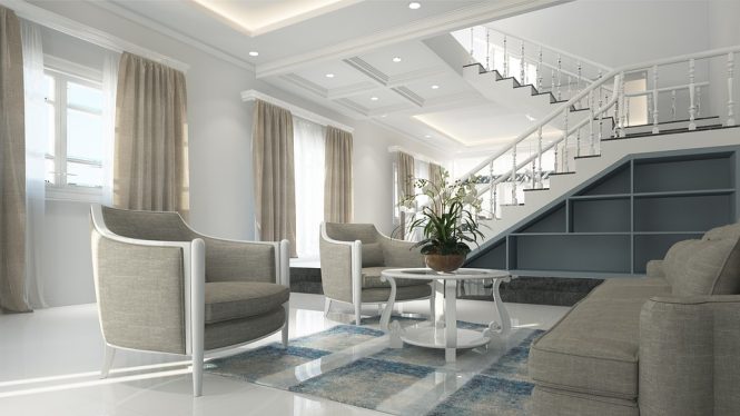
Color Theory in Interior Design
In interior design, color theory is used to create a specific atmosphere or mood in a space. By selecting colors that are carefully chosen to evoke a particular emotional response, designers can create spaces that are not only visually appealing but also functional and effective.
For example, a living room designed to be a relaxing and calming space might feature cool colors like blue or green, while a home office designed to be energizing and stimulating might feature warm colors like red or orange. A bedroom designed to be romantic and intimate might feature rich, bold colors like burgundy or emerald green.
The 60-30-10 Rule
One popular rule of thumb in interior design is the 60-30-10 rule, which suggests that a space should be divided into 60% of a dominant color, 30% of a secondary color, and 10% of an accent color. This rule can help create a balanced and harmonious color scheme that is visually appealing and emotionally resonant.
The Psychology of Specific Colors
Different colors have different psychological effects, and understanding these effects can help us make informed decisions when it comes to selecting colors for our spaces. Here are some of the most common colors used in interior design, along with their psychological effects:
- Red: Stimulating, energetic, and attention-grabbing, red is often used in spaces where activity and energy are desired, such as home gyms or playrooms.
- Orange: Warm, inviting, and stimulating, orange is often used in spaces where creativity and playfulness are desired, such as art studios or playrooms.
- Yellow: Bright, cheerful, and uplifting, yellow is often used in spaces where happiness and optimism are desired, such as kitchens or sunrooms.
- Green: Calming, balancing, and natural, green is often used in spaces where relaxation and well-being are desired, such as bedrooms or bathrooms.
- Blue: Cool, calming, and trustworthy, blue is often used in spaces where serenity and stability are desired, such as living rooms or home offices.
- Purple: Rich, luxurious, and creative, purple is often used in spaces where imagination and inspiration are desired, such as art studios or music rooms.
Conclusion
The psychology of color is a powerful tool in interior design, allowing us to create spaces that are not only visually appealing but also emotionally resonant. By understanding the emotional impact of color and using color theory to inform our design decisions, we can create spaces that promote relaxation, energy, and happiness. Whether you’re designing a home, office, or public space, the psychology of color is an essential consideration that can help you create a space that is both beautiful and functional.